 Some of you will know that I had a previous life as an actor. One of the most important lessons I learned is to “leave yourself alone”.
This refers to the principle of not letting your skills preparation getting in the way of delivering a natural performance. Don’t overthink things, trust your training and let it happen.
I see this as a balance between art and science, the same balancing act required in web design and development. For a recent project, I found this principle could also be applied to the way content itself is presented.
Wall Media provides management services to some very prominent Australians regarding speaking engagements of various kinds. Six years ago I inherited a design that looked good, was all Flash and had no real presence in SEO terms.
Using exactly the same design and structure, I converted it to a static HTML site, which made it much easier to be found in a very competitive search market.
The site has done a fine job so far, easily accommodating changes in Wall Media’s talent roster and competing pretty well with rival sites – some spruiking the same speakers.
Principal Peter Wall finally decided it was time to move to a dynamic site, letting him get more hands on and aiming for a leg up on the SEO front.
It will surprise no-one that I went for a WordPress framework (honestly, I do consider other options but so often I find a complement of framework, themes and plugins makes WordPress irresistible). I used the latest version of Atahualpa, one of my favourites because it’s so easy to customise and invites you to tweak elements you might not otherwise even have considered.
At this point came the directions from the client. Let’s just say that I’ve never seen so many red flags emerge in one go: advice from family members and good mates about which fonts to use, sites to resemble, how to show photos and a lot more. All well-meaning and none easy to apply.
In the end, I found a path that managed to combine most of this advice with my own feeling about a design direction. I decided the key was to not get in the way of the content.
This is a site for a second-party service provider, someone who can arrange for a high profile person to MC a public show, or facilitate a celebrity panel, or host a conference or run a corporate event. The content that will make or break the site is the talent, so that’s what the site should focus on.
Yes, information that establishes the credibility of Wall Media to provide the services claimed is important, but that comes after the site visitor is impressed by the talent.
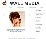
Some text content was removed, some was abbreviated and the presentation of the remaining text was made simple, clear and direct. Biographies are being rewritten now, and are made available for download in PDF. Images were given every opportunity to make an impact, and are also easy to download. The home page gave as much focus as possible to the people on the Wall Media roster, not hidden behind a splash page or text about how good the company is.
I sketched up a wireframe but quickly moved to the browser. I focused on the content, gave it a nice font, a bit of CSS and … left it alone.
It’s very white, spacious and – hopefully – puts all the immediate focus on Wall Media’s impressive roster. I’ve yet to find out if family members and good mates approve, but the Wall Media boss seems pretty happy with it. And so am I.