J One of the truly great aspects of working with clients over a number of years is being given the opportunity to redesign a site.
That could be just applying a new skin, or completely restructuring a site from the ground up.
In the case of Juniper Films, it was brought on by a desire to switch from a static site to a dynamic one that the client could update via a browser.
Needless to say (if you’re familiar with my work), I went for a WordPress set-up. In this case, I used the same theme as for the Juergen Schmeja photography site but adapted it for the needs of our documentary film-making client.
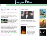
So that gives you the chance to compare two of my sites based on the same theme, as well as the old and new Juniper Films websites – there’s a shot of the old site in the rest of this entry.

It was actually a very interesting process, going over my old notes on the original project, consulting with the client about how they wanted the site to develop and then incorporating what I’ve learned since to come up with a new design.
Since the original site was launched, Juniper Films had released some film compilations on DVD and provided one minute previews to go with them, so that provided a new element, while there needed to be a greater emphasis on marketing their products: the films in various formats, a book, a CD-ROM and a gallery of still photographs.
And it needed a fresher look. Consulting my notes, I saw the client had originally considered a black-themed site.
Having recently launched Juergen Schmeja’s site using the Aurora WordPress theme designed by MB Web Design, I was impressed by its use of shades of black to both functional and visual good effect.
I decided to use the banner space to illustrate and link to as many Juniper Films product pages as I could. I used the background frames image partly out of respect for the now-defunct splash page image of the former site, and for dramatic effect I faded the photo images out to invite a cursory hover to show them in full opacity.
One of the nice things about working on a black background is that colour really stands out, so it was fun working out not just which colours to use but how bright they should be. I may yet tweak a few.
I’ve also tried a technique I’d been hoping to test for a while. When I make video available on websites, the results are often not so great to watch. I’m aware that online video sharing applications like YouTube compress and to some extent reformat videos that are submitted and that the resulting format tends to be watchable by most people.
In this case I’ve used Vimeo as I think their presentation is a bit cleaner than YouTube when embedded in a web page.
All in all, I’d call this a successful redesign.