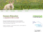
 Another project went live today, this one for Humane Education in Australia.
The site has a very narrow focus: a symposium held in Brisbane in October 2007 that drew together the major players in animal rights to talk about how to embed humane education principles in the Australian education system.
I actually built a site for this purpose at the time (and wrote about it here) but that site evolved into a more broad-based online home for the Oceania branch of Compassion in World Farming, which had organised the symposium with the funding from Voiceless, the fund for animals.
As speakers made their presentation notes and supporting material available, it became clear that a symposium site – if allowed to retain its focus – would still be a terrific resource for interested people, including schools and the general public.
So CIWF enlisted the aid of ACSSO and that brought me back in to design a new site for the symposium.
It’s certainly a nice luxury to focus so closely on one specific event. Even so, the project became as detailed as any other as it became about how best to present the symposium information so that it was easy to find any single element while retaining some cohesion.
I settled on a clean, spacious arrangement, keeping things as uncluttered and direct as possible.
One interesting aspect came to light when I was selecting the images for the page headers. As humane education touches on how humans interact with all animals, and the site was only going to be five static pages. I could use five different images to help illustrate how the topic applied to a range of animals.
I used a number of sources to find the images I wanted, although during this search that I was aware that I didn’t really know what I was looking for. I wanted to avoid twee birthday card animal photos, and I didn’t want gruesome ‘frontline’ photos.
I had a little list of things I was looking for (and avoiding), but I didn’t realise the critical factor until I’d found my five shots. I’m certainly happy with the photos I’ve used, but even after I sent the site live I couldn’t put my finger on why I chose the images I did.
It was only this morning that I worked out that without being consciously aware of it, I had selected photos where the animals have a relationship with the camera, are aware of it and address it.
I think that sets up a whole dynamic of site visitors looking animals in the eye, knowing the animals are looking at them, confronting and identifying with all animals, all kinds of connections. Each of the animals also has that sense of waiting to see what the person behind the camera is going to do. Thematically apt, I think in retrospect.
I did consciously look for things like solo animal/family group/large group settings and staying focused on domestic animals, and I had decided on rabbits for the front page as they have the range of family pet, food animal, farm pest, storybook character, laboratory subject connotations.
But I hadn’t articulated at all that I was looking for photographic images that draw the site visitor into ‘making contact’ and identifying with the animal.
Once I saw that, I instantly lost that still-haven’t-found-what-I’m-looking-for feeling.
If there’s a lesson in that, it’s probably that good web designers must sometimes “leave themselves alone”, as we old thespians put it, just trust your instincts enough to recognise when you’re onto something – even if you can’t articulate it at the time.