Numbers are a key part of how we express ourselves and communicate with each other. They are often used to express concepts that are critical to our way of life: cultural, financial, medical, legal … numbers play an enormously important role in our lives.
It makes sense, then, that when we use numbers in web content, they must be made accessible to all people. In this article, we’re going to explore what the major issues are for number accessibility in web content, who it affects and how, and what web creators can do about it.
Number Disabilities
Some people have disabilities that are directly based on the way they understand and interpret numbers.
Dyscalculia
Dyscalculia is a specific and persistent difficulty in understanding numbers and mathematical concepts. It is not a form of dyslexia, but a distinct condition that manifests with numbers in a similar way to how text can be a problem for people with dyslexia.
It has negative impacts for people when it comes to handling money, measuring objects and distances, understanding and estimating time, remembering numbers, and understanding numerical concepts. Its effects are made worse when numbers in web content, for example, are unclear, inconsistent and overly complex.
Low numeracy
Low numeracy refers to a reduced or lower than expected ability to add, subtract, multiply and divide. It affects the skills required to effectively manage and respond to mathematical demands posed by many different situations, including understanding numbers, symbols, formulas, diagrams, maps, graphs, tables, groups, and text.
Numeracy covers the ability to order and sort, count, estimate, compute, measure, and follow a model, and it involves responding to information about mathematical ideas that may be represented in a range of contexts, including on the web.
Low numeracy is typically the result of limited educational opportunities but is known to affect and have the greatest impact among people living with a range of impairments, conditions and disabilities. For example, generations of deaf people around the world have low numeracy because their schooling systems didn’t address their hearing loss.
Irlen syndrome
Irlen Syndrome is a perceptual processing disorder that affects the brain’s ability to process visual information. It’s often associated with other conditions, including learning and developmental disabilities, ADHD, autism, and acquired brain injury.
It typically manifests in text, including numbers, becoming distorted, blurry, doubled up, non-stable and generally difficult to read. However, even in people without any other conditions, Irlen syndrome can make numbers, in particular, hard to read, especially in contexts where the numbers are not as distinct or clear as they could be.

Math anxiety
Math (or maths) anxiety is a specific form of anxiety disorder that causes panic and confusion in some people when dealing with numbers and mathematics. Anxiety disorders are some of the most widespread mental health issues in the world, and math anxiety is known to be one of the most prevalent anxiety disorders.
It is not associated with learning disorders or intellectual disabilities and can manifest in people who are skilled and high achieving in all other areas of their lives. Math anxiety can be mitigated by reducing the complexity and perceived risk levels of interaction with numbers and mathematical concepts.
Other Disabilities
There are also people who have other disabilities that may have particular impact on the way they understand and interpret numbers.
Low vision
Think of the potential impact for a person with low vision if a “plus” symbol, consisting of a horizontal stroke intersecting a vertical stroke, has such a thin vertical stroke that it becomes invisible to a person with low vision – all they see is the horizontal stroke, which they interpret as a “minus” symbol. The misunderstandings this would create could have disastrous implications. All because someone chose a font with a thin vertical stroke.
Font style, weight and size are critical for people with low vision to fully perceive numbers. It’s not enough to assume people will use text magnifiers or browser settings to make numbers clearer to them. Make them clear from the outset.
Color and contrast
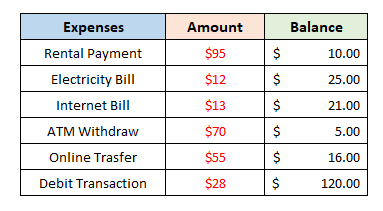
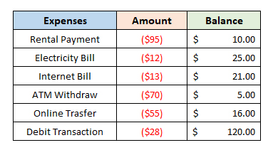
Here, again, the visual presentation of numbers can affect how people perceive numbers. A common convention is to present negative numbers in red to distinguish them from positive numbers in black. This gives a visual impact to, say, a book-keeping ledger to create an overall impression of expenditure versus income, or debit versus credit.
But what if a person has a color vision deficiency that means they can’t clearly distinguish red from black? Chaos! The solution is to add a “minus” symbol to negative numbers, or surround them with parentheses. It’s simple, and effective.
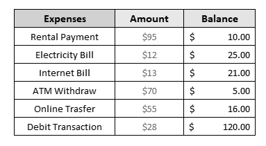
A lack of contrast between numbers, and between numbers and their surrounding text, can also be problematic for people with a range of vision conditions. This includes a LOT of people – think of how many people wear glasses or contact lenses. And then think of all of us struggling to detect the correct price on a product label in a supermarket or department store.
In web content, using a pale gray font on an off-white background might seem like a trendy design decision but it can create a usability nightmare.
Developmental, intellectual, and learning disabilities
A significant number of people are known to have conditions that affect their cognitive abilities. This applies as much to numbers as it does to words. Sometimes numbers are used to express complex concepts that need to be simplified to be comprehensible.
Often these are in documents, including web content, that are of critical financial, medical or legal importance. These are the very contexts in which it is vital that users understand the content. A complex numerical formular for calculating a person’s life insurance premiums must be made available in simplified formats so that all people understand what they are committing themselves to.
Attention deficit disorders
Some people’s cognitive functions may be fine but they lack the ability to stay focused, particularly on content that is densely presented with lots of numbers. Just as breaking up slabs of word content helps people to retain focus and increase comprehension, so will breaking down numerical concepts into bite-sized chunks.
With all these conditions and in all these situations, using plain numbers has been shown to make users more comfortable with numbers in web content in the same way that plain language makes text content easier to understand. Plain Numbers is a UK organisation that researches and advocates for making numbers easier to understand.
WCAG relevance
How web content is presented to all of these people is covered by the Web Content Accessibility Guidelines. In fact, WCAG as a whole applies as much to numbers as it does to text or images. That includes both how numbers are expressed and numerical functions such as equations, mathematical symbols, fractions, and all the other ways we use numbers to communicate concepts.
In particular, web creators should pay close attention to the sections of WCAG that focus on:
- making web content Distinguishable
- providing Enough Time
- and providing Input Assistance
All of these are likely to involve users understanding numerical or numbered web content in some way.
Note that WCAG has a Success Criterion 3.3.4 (Level AA) that focuses specifically on helping users to prevent or, if necessary, correct errors made when inputting data that involves legal commitments or financial transactions.
These are exactly the areas where users will likely need to work with numbers. Medical and health content is also likely to require understanding numerical concepts.
How numbers are expressed
Numerical symbols versus words
There are many ways to express numbers. A common way to express numbers of only one digit in value is to words only: “one” to “nine”. Numbers of two digit value and above are typically expressed in Western cultures using the Arabic numbering system: 11, 12, 13, 872, and so on. However, research has shown that using numerical symbols consistently is better understood in web content, so using 1 to 9 as well as for 10 and above is clearer to web users.
Using words as well increases the clarity further, so for web purposes “You are each allowed to have three (3) apples” can be the clearest way of expressing a number. Context matters, of course, and this is not always appropriate. Writing “two million four hundred and thirty two thousand seven hundred and eleven (2,432,711)” may be appropriate in a legal document like a will, but probably not in every day use.
A less prominent way of expressing numbers, but one still encountered frequently in certain circumstances, is the use of Roman numerals. Building facades, clock faces and, of course, the Super Bowl all often use Roman numerals. This requires some understanding of not just the symbols themselves but how they are used that can be confusing to many people.
Figuring out that “III” on a clock face means “three o’clock” is usually not too much of a stretch, and even if you don’t know the convention of expressing some numerical concepts by putting them together in specific ways, most people can work out what “IV” (one less than five) or “VI” (one more than five) on a clock face mean by their position on the dial. However, a date like “MCMXLVIII” can be incomprehensible to many.
In web content, Roman numerals can also present particular difficulties for people who use screen readers – they may not discern the difference between “X” the number and “X” the letter. Even the best screen readers may announce “Henry V Part I” as “henry vee part eye”. Formatting the Roman numerals in Unicode might not help – not all screen readers can read them correctly.
There is currently no perfect solution for this, no matter what character formatting is used. A lot depends on individual screen reader default settings and user choices. The best you can do is limit the use of Roman numerals, explain the Roman numbers in other numerals or words when needed, and test what works best.


How numbers are used
Proportions
There are several ways of expressing the concept of proportions of a whole in numerical terms. For example, “1/2”, “½”, “half”, “0.5”, “50%”, “50 percent”, and “fifty per cent” all mean the same thing. Which is the clearest for web content is a matter of context and what user agents render best (by “user agents”, I mean anything that presents web content, including browsers, screen readers, media players, plug-ins, and other software).
Most screen readers should announce those seven examples as “half”, “half”, “half”, “point five” “fifty percent”, “fifty percent”, and “fifty percent”. Most browsers should render them correctly on the screen.
People with dyscalculia are known to have trouble understanding fractions. They often cannot process the relationship of the top number to the bottom number.
Because properly rendered fractions usually take up the same space as a single digit and are therefore smaller than surrounding text, they can also be problematic for people with low vision.
Using proportions to express the likelihood of something can also be confusing for many people. What exactly does “a one in three chance” mean? The same goes for percentages or odds. If you use a phrase like “a 30% chance” or “the odds are 10 to 1”, you should explain precisely what you mean. Or perhaps find a better way to express the concept.
In all cases, the only way to be sure is to test – and this should be part of the process of web creation for all web developers, designers and content authors. It’s not enough to make a random decision whether to use fractions, decimals, percentages or words – you have to test to find out what works best. And be consistent – don’t switch from one style to another within a document, a web page or a website.
Money
It goes without saying – but we’ll say it anyway – that how money is expressed on the web is of critical importance. In an age where buying products and services online is becoming increasingly commonplace, it’s vital that people understand how much they’re spending.
Again, there are a number of ways of expressing money concepts: “$26”, “$26:00”, “$26.00”, “$26,00”, “26 dollars”, and “twenty-six dollars” all mean the same thing.
Some are more common than others – you’ll encounter “$26,00” mostly in European web content, where they may also use a period rather than a comma to separate numbers in the thousands, such as “$11.000.000”. This can be confusing for English speaking cultures that typically go the other way round, e.g., “$26.00” and “$11,000,000”. This is more a matter of cultural convention than web convention – there’s only so much you can standardize.
There are, however, some guidelines for expressing money that are worth following. Usually, you can leave off the “cents” or “pence” part if there are no cents or pence. That is, “$26” is clearer than “$26.00” – the “no cents” part just creates more potential for confusion.
Do use commas to separate numbers into groups thousands, such as “$11,000,000” rather than “$11000000” (and yes, “$11.000.000” is also valid). Consider whether expressing money in both words and symbols makes things clearer – in some contexts, “$11,000,000 (eleven million dollars)” is worth the effort. In other contexts, “$11 million” is most effective. Again, whatever you choose, be consistent.
Also note that most screen readers will announce most currency symbols, “dollar” for “$”, “pound” for “£”, and so on. However (and you can guess what I’m going to say here), the best advice is to test with user agents. When you’re dealing with money, you want to be sure.
Time
This is another area where there are multiple ways to express concepts. “Three o’clock”, “3 o’clock”, “3pm”, “3:00pm”, “3.00”, “15:00”, “3PM” are all very common.
Here, again, you want to aim for clarity and consistency. Don’t add the minutes unless they are relevant. Do add the “am” or “pm” to distinguish morning from afternoon, whether you capitalize the letters or not.
Using 24 hour time expressions is increasingly acceptable but you have to consider whether your web users will understand that “fifteen hundred hours” means “three o’clock in the afternoon”, especially when expressed in numerals.
To a large extent, it doesn’t matter whether users know that “pm” stands for “post meridien” and “am” stands for “ante meridien”, as long as they understand they mean “afternoon” and “morning”, respectively. If you have any doubt, such as for a web page you know will be read by people of a non-English speaking background, consider explaining the abbreviation the first time you use it: “3pm (three o’clock in the afternoon)”.
Similarly, you shouldn’t have to explain that “o’clock” means “on the clock” or “of the clock”, but including the word when you’re expressing time in words helps to clarify that you mean time and not some other number, e.g., “three o’clock” or “3 o’clock”.
Dates
Dates are another area where some people have difficulties when it comes to web content, both in reading existing content and when asked to input data, such as when filling in forms.
There are several formats for presenting dates in web content, some of which are based on cultural conventions it would be unreasonable to reject. While some people are used to seeing dates in a month-day-year format, some expect them to be expressed as day-month-year, while others are most comfortable with year-month-day.
The latter format is usually expressed in numbers only, such as “2023/07/04” or “2023-07-04”, while the other two might use a word based format – “July 4 2023” or “4 July 2023” – or a number based format – “07/04/2023” or “04/07/2023”.
The word based formats might also choose to use ordinal numbers that include the last two letters of what the number would be if written out in text, “July 4” or “4 July” become “July 4th” or “4th July”. Ordinal numbers also often have an extra word added in to become “July the 4th” and “4th of July”.
If you’re not sure how screen readers will announce the date as you’ve written it, including whether the dashes or slashes are spoken, test and find out.
Generally all these formats are acceptable and accessible. As a web creator, you have two choices: either offer the users a choice by providing a range of formats they can select from, or pick one format that you think suits your users (ideally as the result of usability testing) and stick with it.
When it comes to form completion, don’t stop people using copy and paste – it’s by far the easiest way to prevent people putting in the wrong password or other numbers. Wherever possible, also support the autocomplete attribute, so that if a user has their bank account number stored in the browser’s memory, they are prompted to complete it by pasting after typing the first digit or two into a form field.
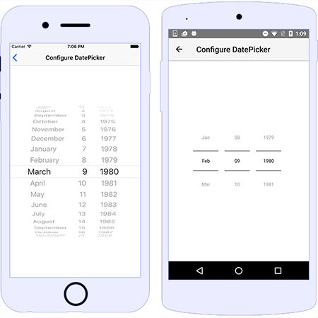
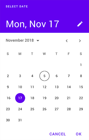
If you provide a date picker or a visually styled calendar, make sure it is screen reader and keyboard accessible and even then provide a text-based alternative. Some people can’t manipulate a spinning wheel of numbers or select one numbered day from a month’s display.
Always enable and encourage users to review the numerical data they input and let them correct it, if they need to.
Tables
Apart from using correct semantic markup and using tables only to present tabular data unless you assign it a presentation role (which you all do, right?), the biggest issue with presenting numbers in tables is space.
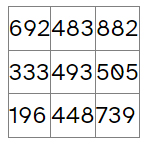
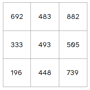
By default, table cells will only be as big as they need to be to exactly contain their content, including numbers. If you have a table of five columns and 10 rows, and each data cell contains a number of exactly three digits, even the sharpest readers will have trouble reading the table.
Give the numbers some space. Style the data cells with some internal padding so that each number can be clearly read and compared to the other numbers – that’s why you’re using a table in the first place: to make it easy to compare the numbers. In fact, making sure that all numbers are surrounded by a bit of space is known to be helpful.
This might seem less important when you’re using a table of numbers as alternative text for visualized data such as a chart or a graph. Sighted people will use the visualization and screen readers will announce the tabular data, so making the table visually readable seems less critical. But be aware that some sighted people have trouble reading charts and graphs and may well refer to the tabular data instead, so you may as well make it easy to read.
Equations
Because HTML was never designed to display complex mathematical equations, these are often represented in web content as images, requiring web creators to write lengthy and complicated alternative text.

MathML has been developed as a markup language that can be used within HTML for this specific purpose and is well supported by browsers and screen readers.
Example of MathML markup
<math display="block">
    <mrow>
        <mfrac>
            <mrow>
                <mi>x</mi>
                <mo>+</mo>
                <msup>
                    <mi>y</mi>
                    <mn>2</mn>
                </msup>
            </mrow>
            <mrow>
                <mi>k</mi>
                <mo>+</mo>
                <mn>1</mn>
            </mrow>
        </mfrac>
    </mrow>
</math>
This is rendered by browsers to appear identical to the content of the image:
and is announced by JAWS as “x plus y squared over k plus one”.
For more examples of MathML in action, see the <math> entry in MDN Web Docs.
Telephone numbers
Be aware that telephone numbers in web content may be automatically turned into interactive components by some browsers, particularly on mobile devices. This depends to some extent on their context and how they’re formatted.
Given that a lot of people do find it useful to tap or click on a phone number to start a call to that number, even on desktop, a good option is to mark up a phone number as a link and include the “tel:” prefix.
<a href="tel:555-923-6874">(555) 923-6874</a>
Screen readers will announce this as a link, followed by the number.
Even so, some screen readers announce phone numbers in unexpected ways. For example “(555) 923-6874” may be announced as “five hundred and fifty-five, nine hundred and twenty-three minus six thousand eight hundred and seventy four.”
While it may be tempting to use something like aria-label="555.923.6874", this will over-ride users’ preferences in their screen reader settings, which you should not do. It’s also theoretically possible to use CSS such as speak-as: spell-out but this currently has very little browser support. The best option is to leave this to the user’s screen reader settings.
Note also that telephone numbers in form fields must be identified by visual text labels or they will fail WCAG Success Criterion 3.3.2 Labels or Instructions. It is not enough to rely on identifying a phone number by visual formatting alone.
Other considerations
Both weights and measures and distances typically involve the use of numbers. However, the numbers themselves are usually straightforward and standardized. It’s the abbreviations used with the numbers that can require some explanation, particularly when they are not obvious, such as “lb” for “pound” or “oz” for “ounce”. WCAG Success Criterion 3.1.4 Abbreviations applies here but note that this is a Level AAA SC.
Numerical concepts in weights, measures, and distances which are expressed in obscure or unusual words might also require some explanation, such as “furlong” and “fathom”. WCAG Success Criterion 3.1.3 Unusual Words covers this but again this is Level AAA. Even so, consider whether some explanation will make number comprehension easier.
It’s not uncommon for the similarity in visual appearance between “1” (the number) and “l” (the lower case letter) to cause confusion (try looking at them in a font like Courier). The same goes for “0” (the number) and “O” (the upper case letter).
Where necessary, rephrase your content to avoid putting these similar characters next to each, such as in passwords, which is both the most likely and the worst place for it to happen.
Numbers and mathematical expressions often require the use of special characters, such as for currency, fractions and equation operators. Be aware that, for example, using the letter “x” instead of the specific character for “multiplied by” written in HTML as “×” can produce unexpected results in screen readers (technically, that semi-colon at the end should be there but browsers are lenient on this nowadays).
Not all screen readers announce special characters in the same way, or the way you might expect. The two most used desktop screen readers, JAWS and NVDA, each have their quirks. JAWS sometimes announces some special characters incorrectly (although it’s much better than it used to be) and NVDA sometimes just skips them altogether.
Some special characters are available on standard keyboards and some are not. Some are well supported by screen readers and some are not. To check, refer to How screen readers read special characters: an update. And test them yourself.
Conclusion
The bottom line is that presenting numbers in an accessible way in web content is critical. So:
- Make numbers clear and visually readable.
- Don’t rely on color alone to convey numerical meaning.
- Present numbers and numerical concepts in the least complex way.
- Don’t use decimal places unless their content is relevant.
- Make numbers in web content accessible to assistive technology.
- Give numbers space, especially in tabular data.
- Be consistent in how you present numbers.
- Make submitting numerical data in forms easy and accessible.
- Help users avoid numerical errors and correct them if they are made.
- Test your web content with screen readers and, ideally, real users.
- Remember that how you present numbers in web content matters – a lot. Make it count.
Resources
- Accessible Numbers
- W3C Gap Analysis: Dyscalculia
- Making Content Usable for People with Cognitive and Learning Disabilities
- Plain Numbers
- Unicode Roman Numerals and Screen Readers
- MathML Fundamentals
- MathML Accessibility Gap Analysis
- How screen readers read special characters: an update
Originally published: https://www.tpgi.com/making-numbers-in-web-content-accessible