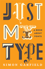
 Just My Type is, as the cover points out, a book about fonts. More than that, it is a very well-researched and engagingly written account of the still evolving history of type, typography, typefaces and fonts.
That it is classified as both Reference and Humour gives you some idea of its approach. It is always interesting, often surprising and sometimes very funny.
It does carry, however, a very considerable oversight.
The author, Simon Garfield, is a British journalist and the author of 11 other books, including a Somerset Maugham Award-winning study of Aids in Britain called The End of Innocence.
He writes for The Observer and makes various articles available at his website. He also provides extracts from his books but, somewhat surprisingly, doesn’t tell you much about hilebmself at all, although you can download a photo of him.
Anyway, there is a great deal to like about Just My Type. From Gutenberg (the inventor of movable type printing) to Luc(as) de Groot (the designer of Calibri, Microsoft’s default font of choice), Garfield profiles the people behind the fonts we have come to use in print and on the web. He describes the ways in which some of the most famous – and obscure – fonts came into being, and he astutely examines the circumstances which made some successful and others less so: technological advances, social mores, language developments and the roles of politics, religion, advertising and art.
This is complex territory, but Garfield maintains a light touch and an open mind: rather necessary when you look at the lives of some of the people involved.
I have no hesitation in recommending this as an entertaining, diverting and highly informative read.
So, what is the oversight to which I referred earlier?
Well, despite being very clear about how fonts have become vitally important to the web and acknowledging the role that the web now plays in generating new fonts and reviving old ones, and despite showing great awareness of the sometimes difficult circumstances in which font designers ply their trade, Garfield makes no mention of the single most frustrating aspect of font selection and management for web designers, which is the limited control they have over which fonts can actually be displayed on web sites.
As they cannot be sure which fonts a site visitor might have installed on their computer, designers have had to implement a font-stack (at least until the recent advent of hosted fonts and the like). This meant we had to include a line of code in our style sheets that asked a browser to display, for example, Verdana or if the user didn’t have Verdana then Arial or, if the user didn’t have Arial then Helvetica, or at last resort any sans serif font that might be installed.
Herein lies a prime example of the difference between designing for the web and designing for print. Those pixel-perfect type models go out the window in a world defined and limited by browser defaults and user selections.
That such a detailed history of fonts as Just My Type does not even refer to this development, which fundamentally changes the role of the font designer and takes control away from them, seems to me entirely inexplicable.
However, even with that caveat, I still recommend the book: it is guaranteed to make you look twice at the fonts around you in your day to day life.