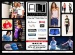
 This was fun. FILT Clothing is co-owned by one of the people who run my favourite coffee shop, Cafe Angeli.
They’re next door to each other and when the opportunity came up to design “just a basic website” for FILT, I naturally suggested an arrangement that would limit the financial impact on both the clothing store for the website and my wallet for the latest infusion of flat-white-double-shot-thanks-Rom.
Something along the lines of the Stafford’s Cheese experience, where I had unfettered (that is NOT a pun) access to some of the world’s finest cheeses for just about a year.
In this case, I had “the chat” with “the client” at “the cafe”, and by the time I’d finished my second cup of yes-thanks-Rom, not only was the deal done but I had “the idea”.
Even as I mocked it up in Photoshop, I knew that I was working on the real thing. And that’s what’s on the site now – the mockup.
It’s just one big jpg with usemap links to a contacts page, a legal statements page and a popup box to join the shop’s email list.
It validates for HTML, CSS, accessibility (OK, I haven’t put it through the most rigorous tests) and general goodness. Mostly.
It’s very commercial, very brochure, and I like it.
I think I most enjoyed having the opportunity to lay out a series of images both to evoke the sense of certain clothing manufacturers and also to relate to each other enough to create a postive impression of the place where those particular labels are available in the one place: my client’s shop.
It needs to – and it will – develop over time to a more conventional grid HTML structure that allows for each visible section to click through to product pages and so on, but that’s for future negotiation.
I often think of words as being my forte, so it was nice to take a walk on the visual side.
And what a payoff.
Yes-thanks-Rom.