There’s a lot to be said for keeping it simple.
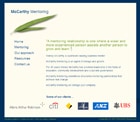
 The latest website to emerge from the Onsmansion is for McCarthy Mentoring.
Wendy McCarthy has been a client of mine for several years and we’ve taken her personal website through a few incarnations in that time.
When Wendy brought her daughter Sophie on board to take her management consultancy to another level, I was fortunate enough to be asked to realise a web vision provided by graphic, urban and interior design team Minale Bryce Design Strategy.
This was a very specific, detailed and beautiful vision, provided as four sample pages in TIFF and Illustrator formats, supported by a PDF of notes on fonts, colours, spacing, even stock photo sources.
My task was to realise this as a web page.
It proved to be a really interesting exercise: trying to be as true to the letter and spirit of the template designer as possible while building a semantic, valid, accessible, cross-browser compatible website filled with clear, interesting, informative, accurate and actionable content.
The only place where I think the graphic designer might feel their vision was really compromised is in the choice of fonts. I used font-family to call the more obscure fonts specified as first option, but the reality is that most people will see the more common fonts defaulted to.
And of course, real content changed the look of each page, and more pages were added.
But I definitely think the craft – and art – that went into the design draft made my job more pleasurable, and easier because of that. I don’t think I’d have such a good time keeping tightly to a design that I didn’t like.
Which, of course, some web designers and developers have to do most – if not all – of the time.
In this case it was great for me to work off someone who really understands space, colour and positioning.
And keeping it simple.
I hope it serves the McCarthies well.